Growth design for slack pricing pages
Slack’s pricing pages don’t just exist in a logged in/logged out state. One half of the experience is owned by Product, and the other half is owned by Marketing. How can we align both experiences, with two different teams of stakeholders, and two different design systems, into one unified experience with optimal operational efficiency? Slack hired me as their Growth Designer for a contract role to do just that.
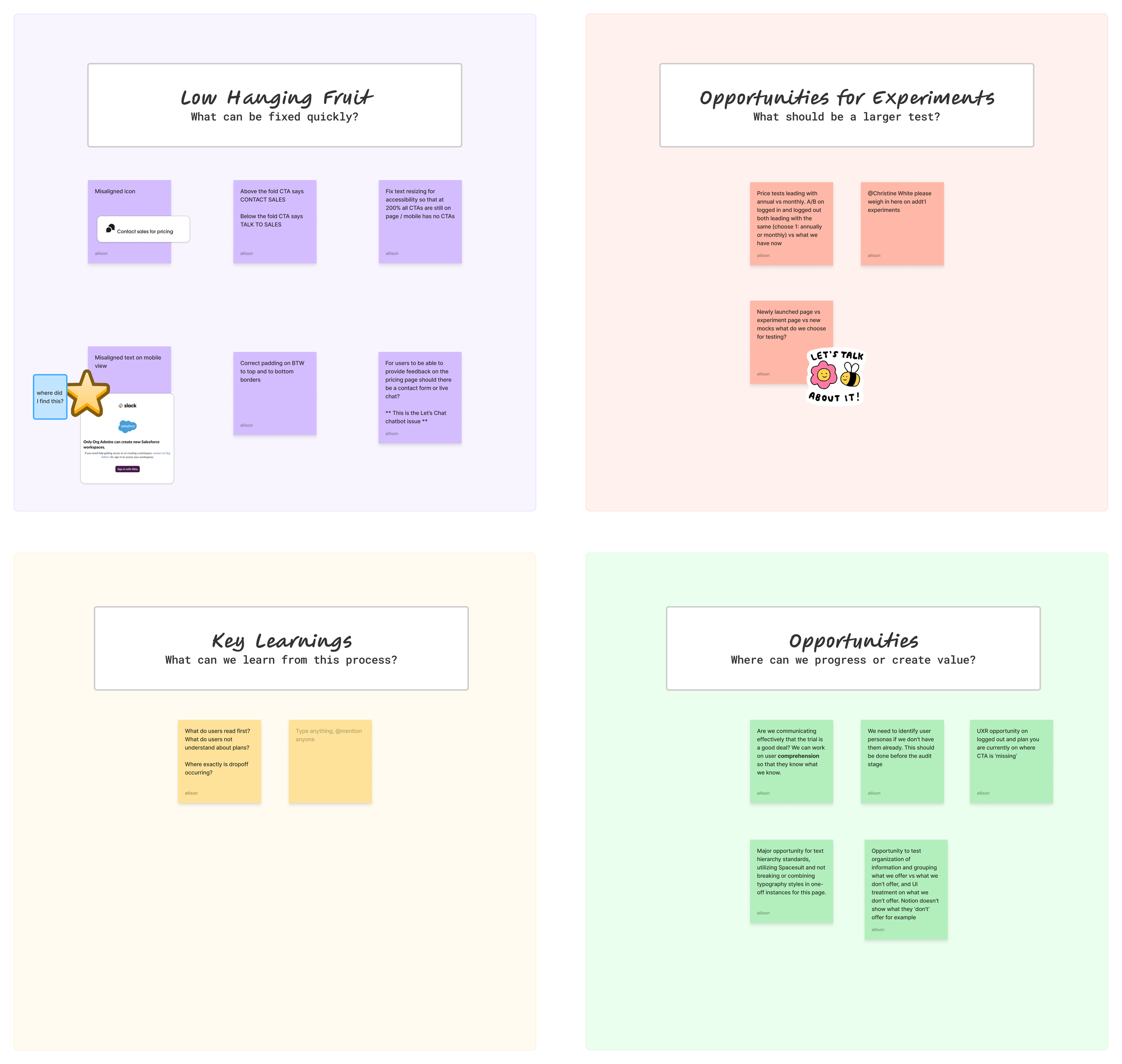
After a download of previous and current user research for both of Slack’s pricing page experiences (Logged In and Logged Out), I began a design and UX audit of their Logged Out experience. Users that arrive to the Logged Out page include both existing Slack users and potential new users. The full details of my audit included low hanging fruit, research/experimentation opportunities, interruptions in the UX flow, accessibility improvements & a competitive audit.
Upon completing my extensive audit, I was able to report my findings back to Marketing, making sure to include stakeholders from the Product experience for the pricing pages. There were a few glaring issues with the pricing page from a visual and content design (language, comprehension) perspective that presented themselves as low-hanging fruit; improvements that we could test upon rapidly.
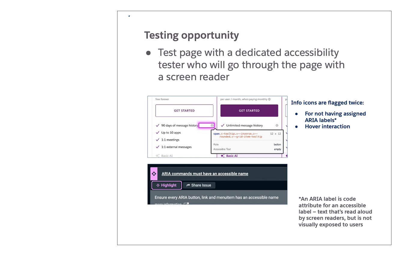
More complex issues were around accessibility and UX on the page as it related to the user flow once the user navigated further into the Slack sign-up experience. For those concerns, I suggested user testing, making sure to include users from the accessibility community.
=
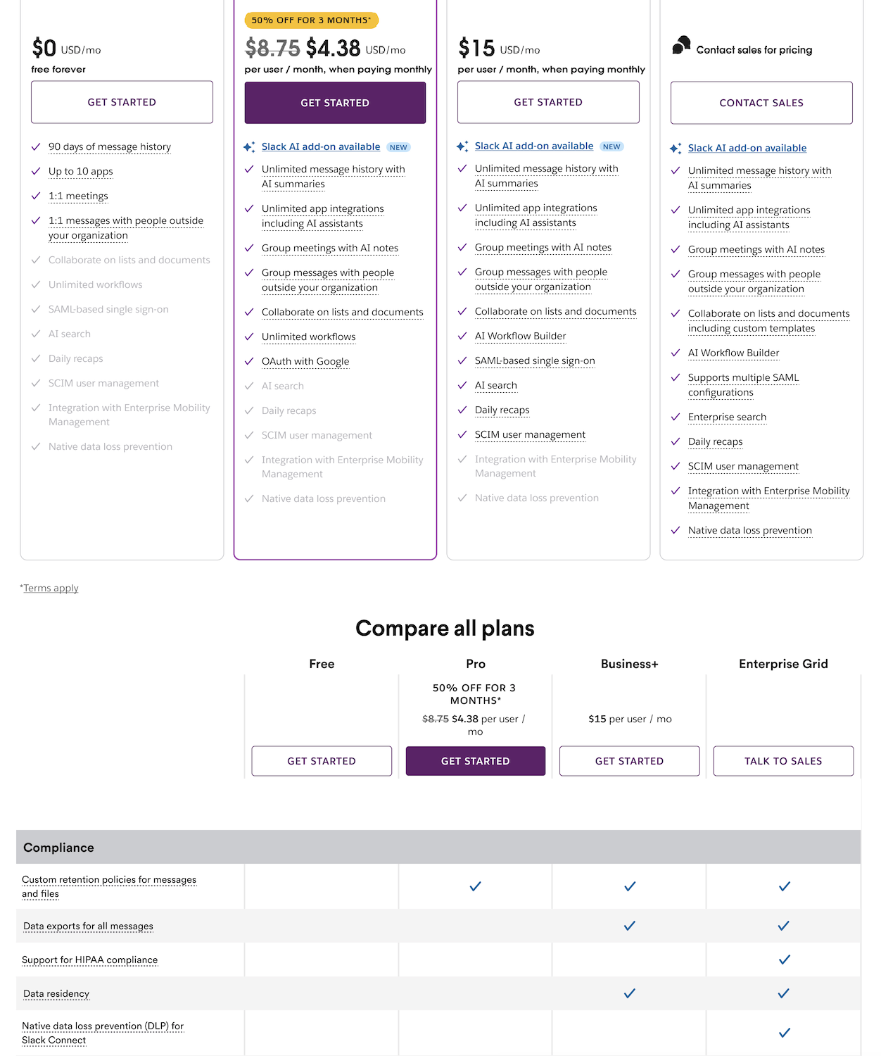
(Left) image of Slack pricing page before redesign
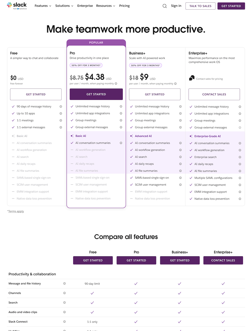
(Right) image of Slack pricing page after redesign changes
After testing and running experiments, I was tasked with making various iterations to both the Logged In and Logged Out pricing pages on web and mobile. Marketing preferred to make small changes at first and test rapidly, and do a major design overhaul further down the road once they tracked analytics of how the smaller scale changes performed amongst users.
In terms of the new designs I provided for the Logged Out Pricing Page, the Growth team was able to track lift once the pages were simplified in their design (lighter use of contrast, color, and typography stylings). Price and differences between what is included in plans was emphasized, accessibility concerns were addressed and complicated jargon or terminology was used sparingly, making the page as accessible and user friendly as possible for users who are unfamiliar with Slack’s offerings.


